CHALLANGE: PIZZA ORDER
DURATION: 2 days (a weekend challenge)
Completed in July 2022
ABOUT
This challenge was one of the crowwwn.com’s weekly UX challenges where participants are given a weekly prompt to design a unique solution to a problem. Crowwwn aims to focus on the solution to the problem and the experience rather than visuals alone and winners are chosen by the judge of each week’s challenge.
I approached this weekly challenge as a weekend challenge and submitted in 48 hours.
PROBLEM
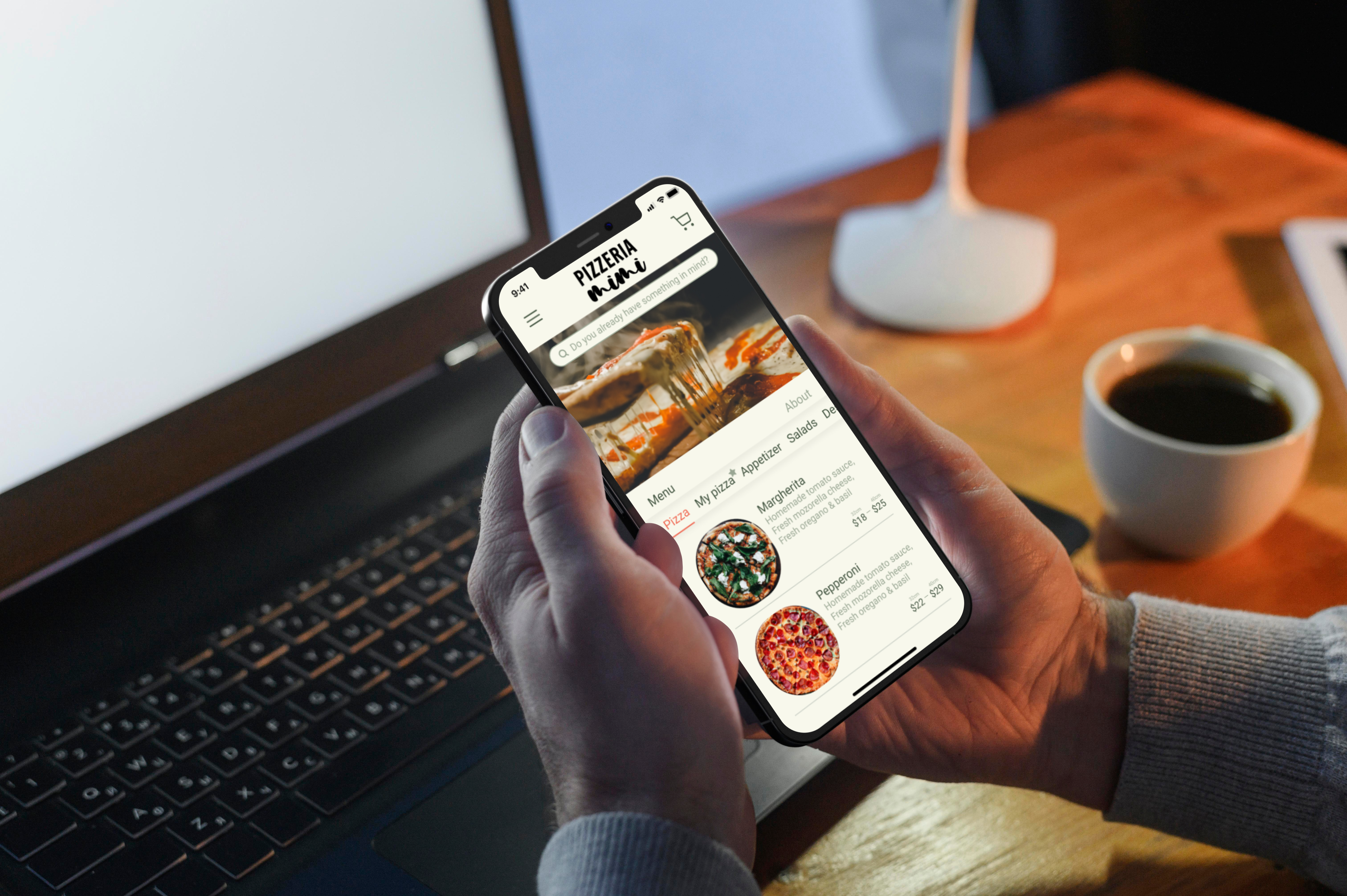
Pizza Ordering Challenge: When I order a pizza, I want to be able to see what my pizza looks like while I choose toppings, so I know I am getting exactly what I want.
MY APPROACH
I know this challenge was about “knowing how pizza looks while ordering it” but this “urge to know” actually comes from the feature of customizing the pizza to order. I saw this as an opportunity. As a result of my quick research on customizable foods and food delivery apps, I defined a few more problems in addition to the problem given in the challenge and tried to solve them as well.
NEW FEATURE
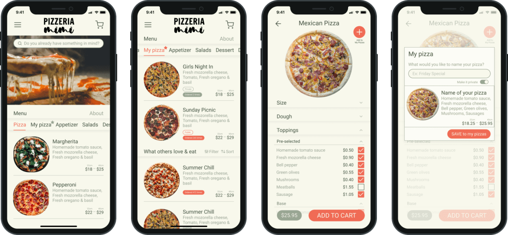
Saving your own customized pizza for later use, or even posting it publicly so others can order it too. To be able to filter or sort these pizzas according to the most ordered or a specific ingredient.
NEW FEATURE
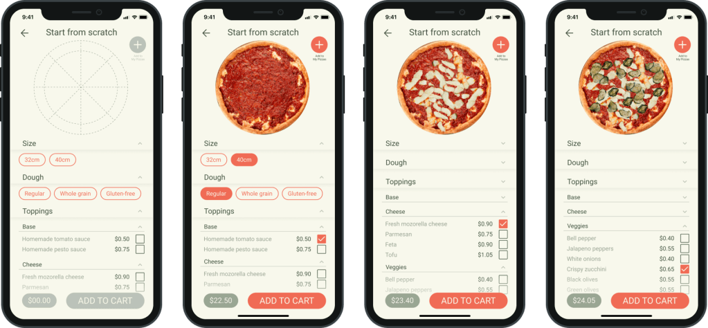
Starting completely from scratch should be added as an option but the feature of choosing from familiar pizza selection and being able to edit them should always be preserved.
IMPROVEMENT
In the current situations, removing pre-selected toppings does not lower the price. The reflection of this on the total is also important.
IMPROVEMENT
Pizza ingredient lists are too long, dividing them into sub-categories makes it easier to find ingredients.
FINAL THOUGHTS
Participating in a 2 day challenge taught me a lot. Design processes are not straight lines. With a limited time schedule like this, it is important to know when you will revisit a design step and how long you will work on that. Thinking about multiple steps at the same time allowed me to use my time efficiently.
When I looked back a few days after the challenge ended, the UI felt cramped and the spacings did not feel right. Also I found a few misleading texts & buttons as well. I would love to build a version 2 for this design some day.
