CASE STUDY: Meal Kit App
DURATION: 1 Week
Completed in March 2026
DESING BRIEF
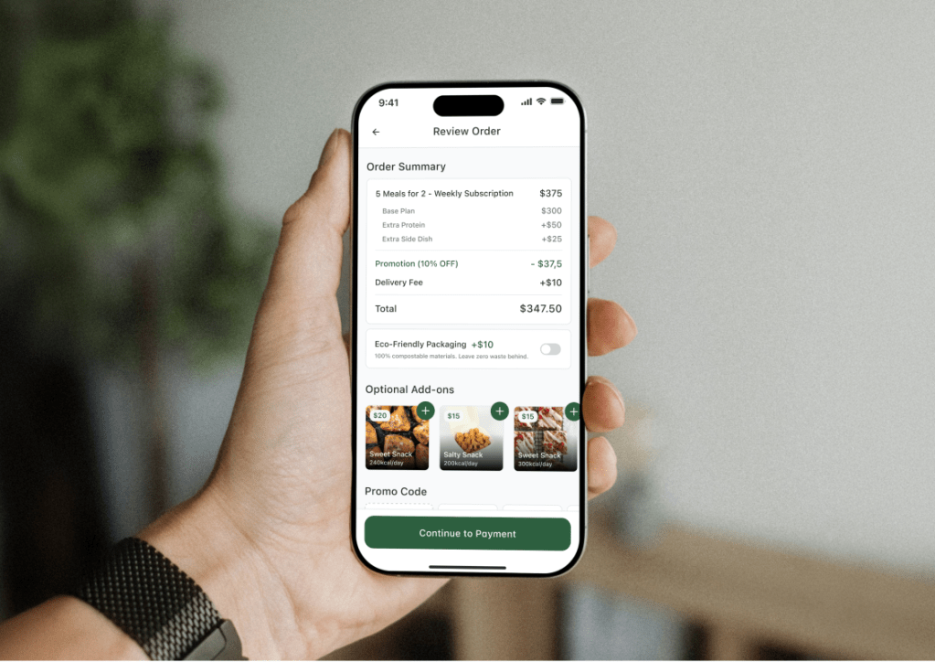
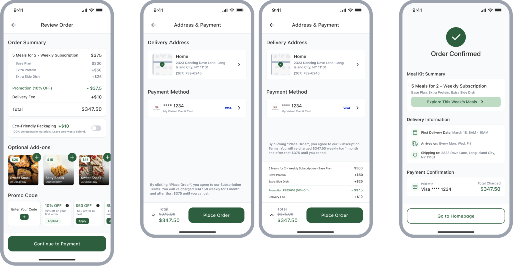
To design a 4–6 screen mobile checkout flow for a meal kit subscription, transforming a complex, multi-layered pricing structure (base plan, protein upgrades, delivery fees, and a 30% introductory discount) into an intuitive, transparent, and high-conversion transactional experience.
SUMMARY
By shifting core personalizations earlier into the configuration phase and introducing a dedicated “Review & Add-ons” step, I eliminated the “mental math” fatigue and transformed a complex payment pipeline into a transparent, trust-building user flow.
EASY ACCESS
01
UNDERSTAND
The Core Challenge
Designing a checkout experience where the price is dynamic and multi-layered (base costs, personalized upgrades, and conditional discounts).
Potential Friction Points
The “Mental Math” Fatigue
Problem
Users have to manually track how base prices, protein upgrades, and discounts interact.
Impact
High cognitive effort leads to frustration and cart abandonment.
UX Law – Hick’s Law
too much complexity slows down decision-making
The “Black Box” Pricing
Problem
Seeing a final total without a clear bridge from the initial price.
Impact
Users feel “tricked” by hidden costs, leading to lower trust and higher churn.
UX Law – Principle of Transparency
Information Overload
Problem
Treating every line item (delivery, taxes, add-ons) with equal visual weight creates clutter.
Impact
Users struggle to find or miss crucial information until it’s too late.
UX Law – Miller’s Law
the need to “chunk” information into digestible groups
02
IDEATE
Key Strategic Decisions
Designing a checkout experience where the price is dynamic and multi-layered (base costs, personalized upgrades, and conditional discounts).
Personalization vs. Upsell
The Choice
Integrating some choices like “Protein Upgrade” as a core product configuration rather than a last-minute upsell.
The Logic
Nutrition is personal. Building it into the setup phase creates a “tailored” feel and prevents “hidden cost” frustration at the final step.
Trade-off
It adds slightly more initial effort (Cognitive Load), but it significantly builds long-term trust.
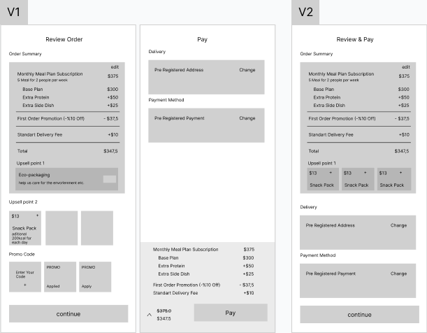
Flow Architecture: Two-Step vs. Single-Page
The Choice
Creating a dedicated space for “Review & Add-ons” before the payment screen.
The Logic
The review stage is not static. Users may be eligible for multiple discounts or decide to add on something in last minute. Providing a dedicated screen for these interactions prevents “Mathematical Fatigue” and keeps the payment step clean and focused.
The “Ecosystem” Assumption
The Assumption
The user is part of a broader health ecosystem.
The Logic
A standalone meal kit app is often too limited.
The Focus
This allowed me to skip data entry and focus entirely on price transparency and customization.
03
DESIGN
I translated backend multi-layered pricing data into an interface that prioritizes real-time mathematical verification, establishing a clear visual hierarchy where base costs, active adjustments, and finalized totals are logically bridged.
04
FINAL THOUGHTS
I looked at the checkout experience not as a final, isolated transaction, but as the foundational touchpoint of a long-term subscription relationship. Moving forward, the goal is to validate these behavioral patterns through direct interface testing and extend the architecture deeper into the post-purchase lifecycle.
I Would Love to Test
Entry Point Performance:
Whether moving “Extra Snacks” or “Side Dishes” earlier into the meal selection phase performs better than showing them as “add-ons” at the final checkout.
Key Metrics:
Measuring precise conversion rate differences between these two entry points and tracking micro-abandonment rates at the review step.
If I Had More Time
The Post-Purchase Experience:
I would love to focus on the post-purchase experience. A checkout isn’t a one-time event in this model; it’s the start of a relationship. I’d focus on how easily a user can “Pause,” “Skip a Week,” or “Swap a Meal” to reduce churn and increase long-term trust.
The Missing Links:
I would expand on the visual design decisions made during the transition from wireframes to high-fidelity screens.
