CASE STUDY: Loopin
DURATION: 1 Week
Completed in Oct 2025
ABOUT
Loopin is a social mobile app that helps small groups of up to five friends stay connected throughout the day. It creates a shared digital space for users to chat, co-study, share quick moments, and maintain a sense of togetherness while apart.
DESING BRIEF
The goal was to design an engaging and playful experience tailored for Gen Alpha and younger Gen Z users in the U.S., who communicate primarily with close friends and expect fast, expressive, and visually dynamic interfaces.
The challenge was to move beyond traditional chat app conventions and design something powered by Generative AI elements that reflect each squad’s shared vibe.
MY ROLE
As the Product Designer, I was responsible for defining the product’s visual direction, rethinking the initial wireframe provided by the PM, and prototyping key user flows.
SUMMARY
Through this project, I explored how digital intimacy can be strengthened within small friend groups using generative AI and lightweight social interactions.
The result was a concept that emphasizes everyday connection over follower count. Focus was designing for shared energy rather than social validation.
EASY ACCESS
01
EMPATHIZE
Before starting the design process, I wanted to understand what “togetherness” means for Gen Z and Gen Alpha users who primarily socialize online.
Through a combination of trend research, competitive analysis, and user behavior observation, I explored how these generations communicate, what keeps them engaged, and what makes digital spaces feel emotionally “alive.”
- They prefer to share small, imperfect moments privately
→ Loopin needed to feel intimate and safe, not performative. - Static screens feel “dead.”
→ Every tap and transition should respond with movement or light. - They skim, not read. Visual cues, short phrases, and emoji-driven UI are essential.
→ UI should guide behavior without relying on text explanations.
My focus was on crafting an interface that captures Gen Z and Alpha users’ emotional language (fast, visual, and fun) while maintaining functional clarity in a dark-themed environment.
02
DEFINE
Before proposing any design direction, I started by evaluating the initial wireframe delivered by the PM. My goal in this phase was to understand how well the suggested structure aligned with the product vision: enabling Gen Z & Gen Alpha users to stay connected with their closest friends throughout the day.
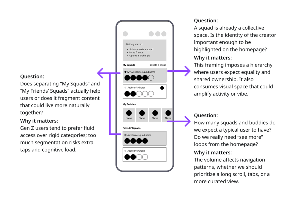
Based on this evaluation, I defined two primary challenges:
“How might we create a homepage that prioritizes immediacy, fun, and effortless access to close connections?“
and
“How might we reduce cognitive load while still supporting small-group dynamics that feel personal and expressive?“
These insights became the foundation for my design decisions in the next phase.
03
IDEATE
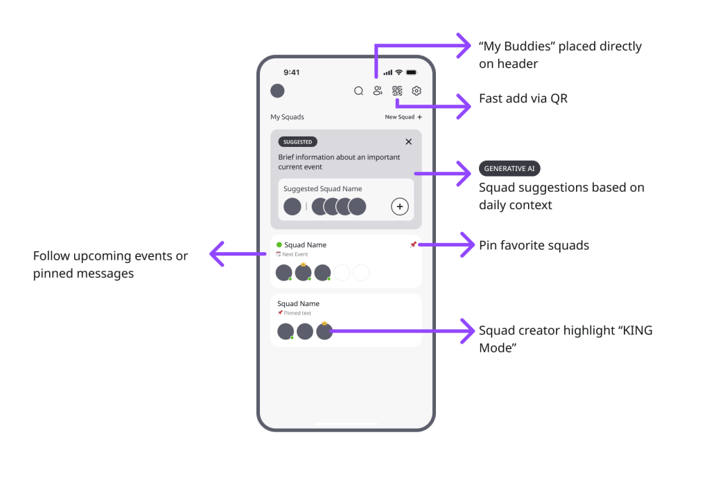
In the ideation phase, I translated the insights from the wireframe review into interface decisions. My goal was to propose a structure that better aligned with the needs and behaviors of Gen Z & Gen Alpha users, while increasing the sense of belonging, activity, and playfulness.
BONUS: Auto-Generated Squad Portraits
Weekly chat patterns (mood, activity, keywords) are turned into a fun visual portrait that squads can set as their group photo.
BONUS: Buddy Relationship Insights
Simple, non-judgmental metrics (humor, vibe, trust) help users understand the dynamics of their closest friendships in a playful way.
BONUS: Smart, Contextual Nudges
Light reminders triggered by chat inactivity or upcoming moments (exams, events) encourage users to reconnect or take action with their squads.Concept Ideas
By reframing the structure around immediacy, emotional resonance, and playful interactions, the proposed experience better fits the behavior, expectations, and visual culture of Gen Z and Gen Alpha users.
04
DESIGN
This phase focused on translating insights into a playful, intuitive, and socially expressive mobile experience.
I refined core flows (onboarding, personalization, the first-time user’s homepage, and the returning user homepage) to ensure they all reflected the habits and expectations of Gen Z and Gen Alpha users. Every interaction is deigned for supporting fast communication and tight-knit group dynamics.
Playful, Trend-Driven First Impression
Loopin’s onboarding introduces the product with fast, punchy messaging tailored to Gen Z and Gen Alpha attention spans. Each screen sets expectations for what the app is really about: planning moments with friends, understanding social dynamics, and staying in sync with trending topics. The tone is intentionally fun, energetic, and slightly chaotic to mirror how young users communicate and bond.

A Youth-Centric Voice that Feels Familiar
Instead of formal profiling questions, I used playful, culturally aligned wording that mirrors how teens actually talk. The goal was to reduce friction and make identity-selection feel expressive, not transactional. These screens reinforces that Loopin speaks the same language as its audience; quick, humorous, and vibe-first.

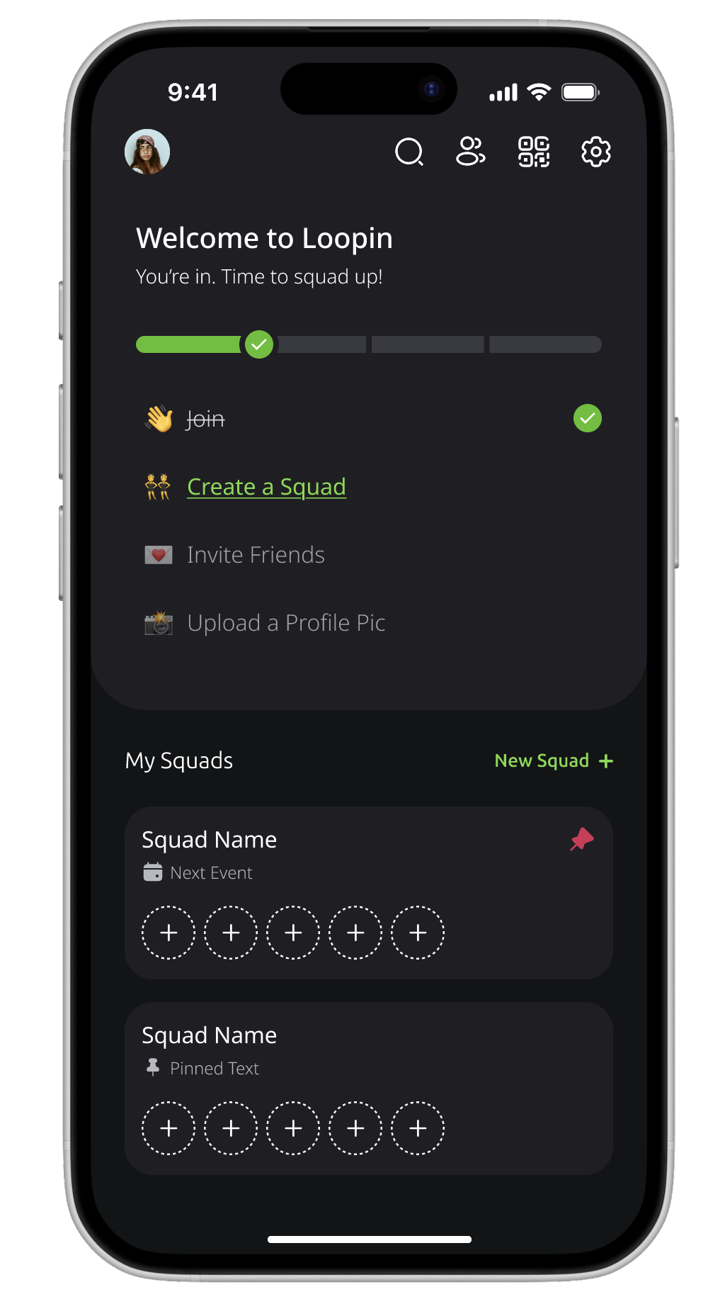
A Friendly, Guided Start Instead of an Empty Screen
Dropping users into a blank homepage often leads to confusion and early abandonment. To prevent this, I designed a structured first-time view with clear starting actions and imaginative empty states. The top section provides simple “first steps” for getting set up, while the lower section visualizes what squads will eventually look like. This helps users picture the value before they create anything.
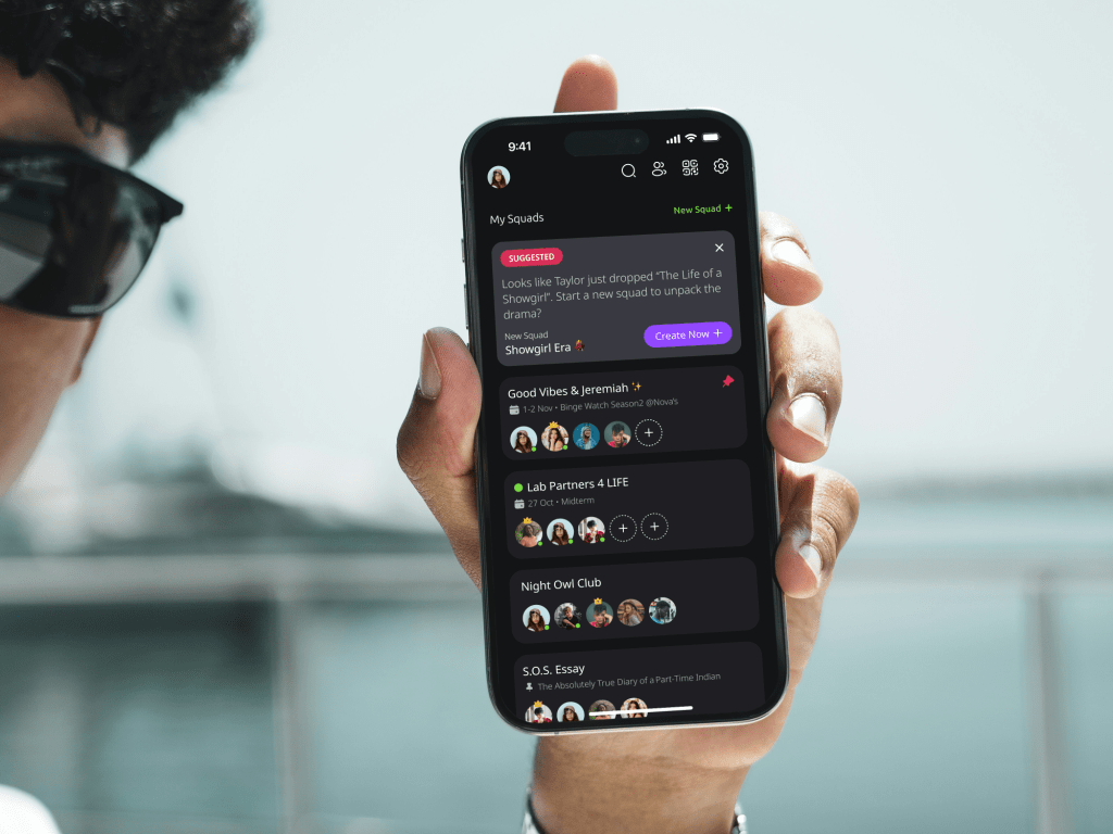
Dynamic, Activity-Driven Home for Real Daily Use
For active users, the homepage evolves into a lively hub powered by ongoing squad activity. Instead of showcasing every feature, the design focuses on surface-level momentum like upcoming squad plans, pinned highlights, suggestions based on daily trends, and playful cues about squad creators. The goal is to make the home feel alive, personal, and socially magnetic.
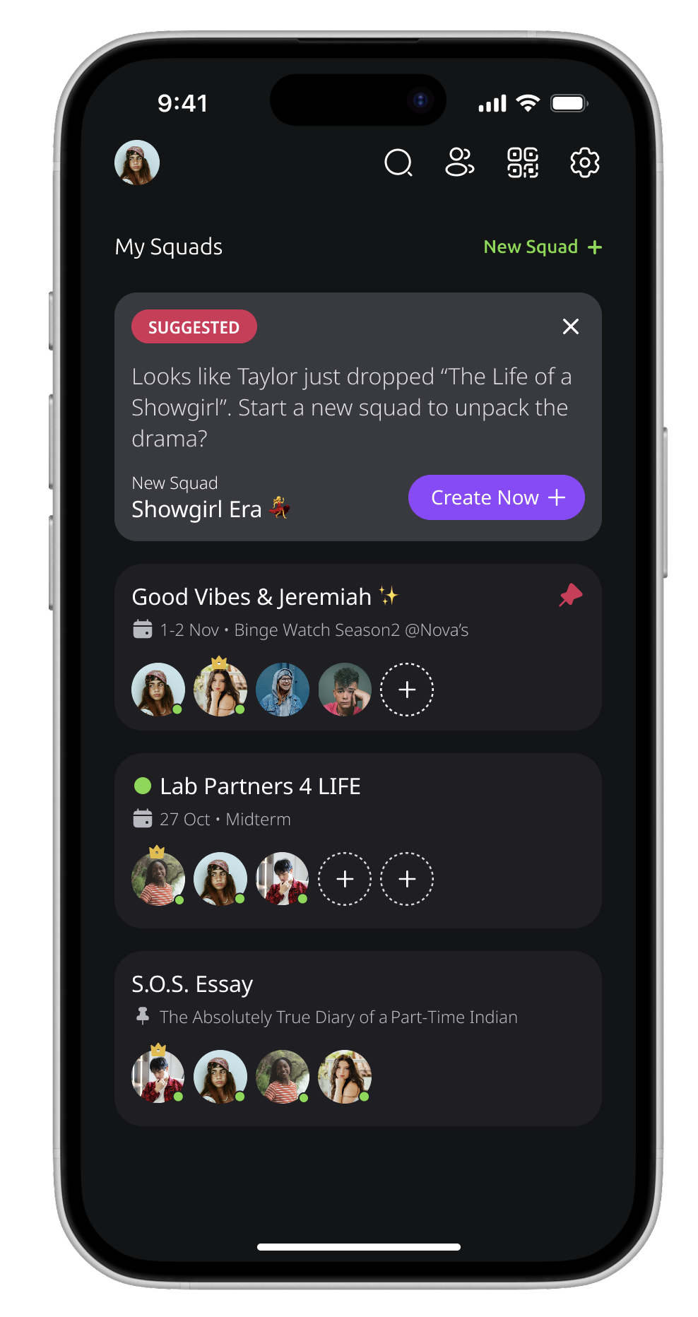
Brand Energy from the First Millisecond
To reinforce Loopin’s playful identity, I designed a custom app icon and a motion-driven splash screen. These small touches help the product feel polished and memorable.
05
WHAT’S NEXT
This project reinforced the importance of designing with cultural behavior in mind and not just functional tasks. Understanding how young users communicate, joke, plan, and bond allowed me to craft an interface that feels natural and expressive to them.
If developed further, I would conduct usability tests with real Gen Z/Alpha users to validate tone, interaction speed, and mental models. Future iterations could also explore deeper AI-powered squad insights, adaptive home feeds, and more playful motion to strengthen the sense of social presence.
