CASE STUDY: ISBIKE
DURATION: 12 weeks (alongside a full time job)
Completed in June 2022
WHAT IS İSBİKE?
İSBİKE is a “Smart Bicycle Sharing System” put into service by the Istanbul Metropolitan Municipality for a healthy and environmentally friendly transportation in order to encourage the use of bicycles as a means of transportation apart from being used for entertainment and sports purposes.
GOAL
My aim in this redesign project was to make the product more friendly & attractive to the user by improving the existing user experience, since the municipality’s main goal is to provide better services to citizens.
SUMMARY
Since this was a self-initiated redesign project I was the sole UX Designer. I conducted research on Smart Bicycle Sharing Systems in different countries and also some indirect research on specific features alone. I looked at online user reviews to better understand the current application. Based on this knowledge, I created user personas and map their journey. After defining the problems & suggesting solutions, I started to brainstorm some ideas with the insights I gained. I played with different solutions by creating low-fidelity wireframe sketches and narrowed these options down to build some medium fidelity wireframes & prototypes. Next, I conducted user testing, analyzed the findings and redefined the problems & solutions. I continued with creating the UI & prototype of this redesign.
01 RESEARCH
COMPETITIVE ANALYSIS
I conducted research to see what the strengths and weaknesses of the most used Smart Bicycle Sharing Systems of 4 different countries are.
ONLINE OVERVIEW OF THE APPLICATION
After doing an online research on the ekşisözlük, twitter, app store and google play, I have grouped users’ problems/requests/comments under several main headings, excluding the maintenance demands and inconvenience of the bikes.
STATION
In some places, the user prefers not to use a bike as there are no bike stations close to the arrival and starting points.
After reaching the destination, the user loses time by searching for a new station for parking due to the fact that the parks are full.
PROVISION
The refund period of the provision fee is too long.
TRIP STATUS
Information such as the time you started using the bike, the route you took, the number of calories you spent, the pick-up and drop-off stations, how long you have been using the bike can be displayed after the bike is delivered. Since the user cannot view how long they have been using the bike, they often have to deliver the bike early to avoid paying extra hourly charges.
CONTACTLESS PAYMENT / RENTING
Contactless rental systems should be developed instead of touch screens in rental devices.
MAINTENANCE
When the user goes to the bike station to rent a bike, he/she cannot find a working bike. It is not possible to track whether the bikes are under maintenance via the mobile application.
ISTANBULKART
IstanbulKart should be used as a payment method.
02 EMPATHIZE
USER PERSONAS & JOURNEYS
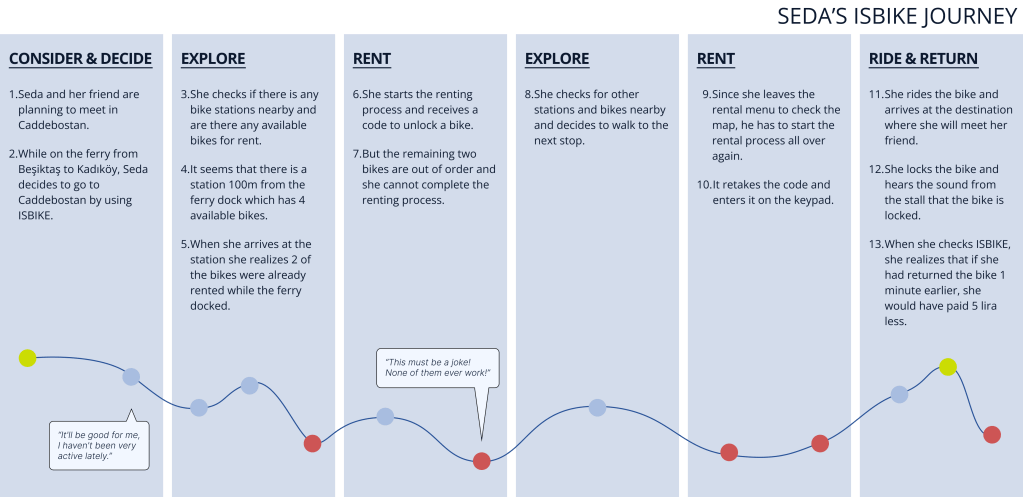
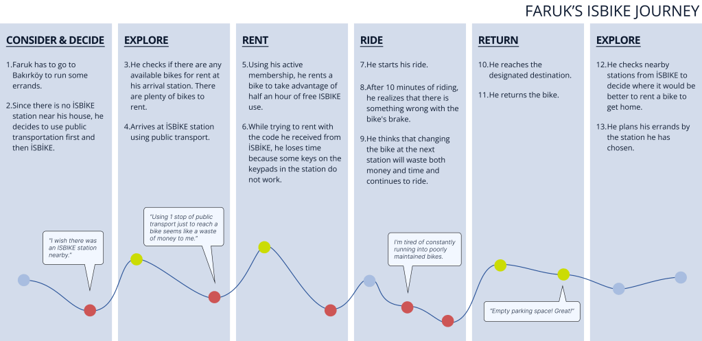
After collecting the information I gained from all the research, I had a deeper idea of who the main user would be. Then I created 2 user personas to be able to focus on users’ problems and mapped their user journey.
This exercise helped me understand the missing parts of the users current experience and what they felt during their journey of using the ISBIKE. It also guided me to which points of the user’s journey that I should focus on.
03 DEFINE & IDEATE
In this stage, I defined what users’ needs and problems are, then I prioritized these findings. I started thinking about the solutions to users’ problems.
PROBLEMS & SOLUTIONS
Not knowing current status while riding causes unnecessary rushing and extra billing issues.
Information such as the time you started using the bike, the route you took, the number of calories you spent, the pick-up and drop-off stations, how long you have been using the bike can be displayed after the bike is delivered. Since the user cannot view how long they have been using the bike, they often have to deliver the bike early to avoid paying extra hourly charges.
There aren’t enough stations around Istanbul and not every station’s location is convenient for everyone.
Users can suggest a station location within a certain distance according to their needs. A new station can be opened when a sufficient majority is achieved in a certain area in line with common needs. With this feature, users can feel more involved while the company can make data-based decisions.
There is always a broken bike.
For maintenance issues adding a report feature makes the maintenance more sustainable. If the station is under maintenance it should be visible from the app. Also, which bikes are available for rent and which are reported should be seen on the app.
The bikes are taken while the user walks the station.
The bike can be reserved for 5 minutes to ensure that the bike is not rented by someone else until the user reaches the station. To be fair, each user can only reserve once in a 2-hour period and the user should also see if the bikes reserved at the stations.
Covid conditions and broken keypads frustrate the user.
With QR code technology, users no longer need to use keypads.
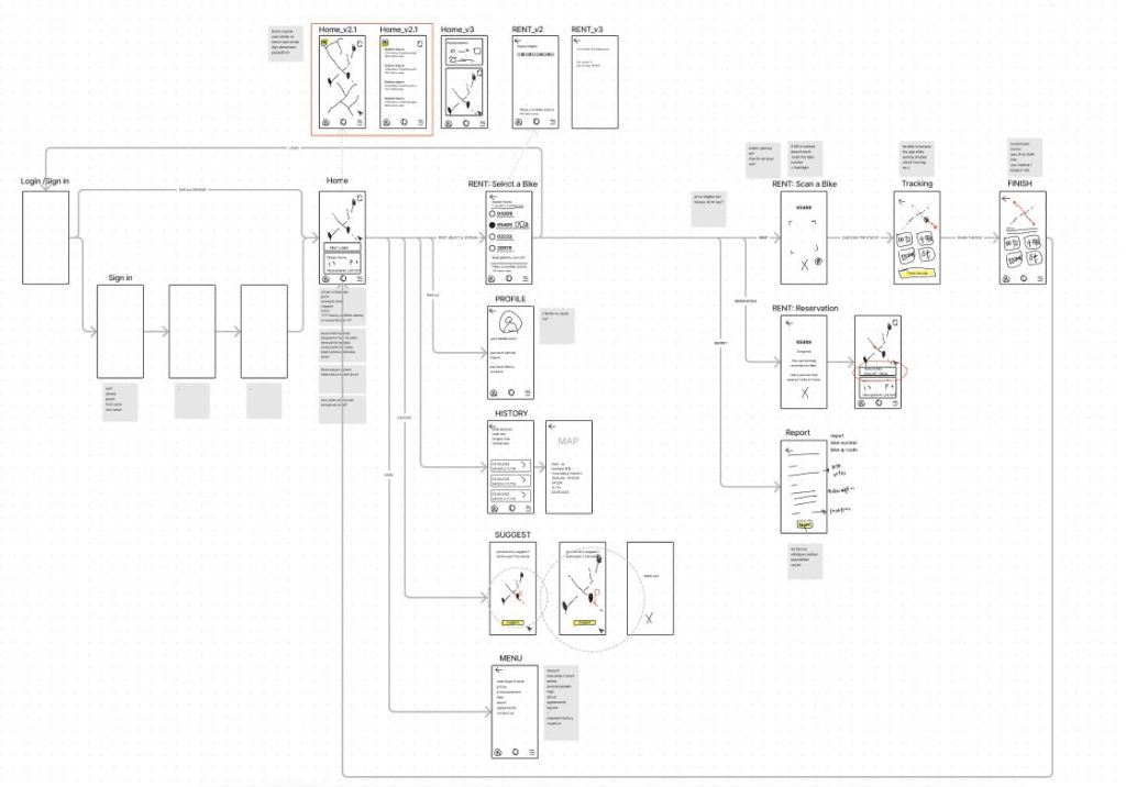
04 LOW & MID FIDELITY WIREFRAMES
05 PROTOTYPE & TEST
USABILITY TESTING
I create prototypes of selected solutions to observe problems. Using “app.maze.co” I tested the mid fidelity prototypes with 8 people. The group consisted of 5 females and 3 males aged 19-34. 3 of them at least one time user and 5 of them never been a user.
Each user had 4 missions which were “Find & Rent a Bike”, “Find & Reserve a Bike”, “Suggest a New Bike Station” and “Check Your Latest Ride Details”. Although “app.maze.co” is a very good tool for detecting problems, I conducted post-test interviews with users who completed the test to ensure that no information was skipped.
Although “app.maze.co” is a very good tool for detecting problems, I conducted post-test interviews with users who completed the test to ensure that no information was skipped. With the findings from this test, I started to shape the final design.
MAIN TAKEAWAYS FROM USABILITY TESTING
LIST VIEW: List view icon means menu to some users. Users prefer map view and find list view meaningless
HOMEPAGE ICON: Hard to identify which icon is a homepage
RIDE HISTORY: User tend to search their previous rides at the profile section
RESERVE: Ride history icon and reserve icon are very similar and it leads to confusion
RENT: Hard to navigate to “rent a bike”
SUGGEST A STATION: Suggesting a station is not a daily task. It is confusing to see this function on the homepage. Task icon resembles “renting a new bike”. Users expect to double click or long press to drop a pin and suggest.
REPORT: Reporting a bike usually occurs after renting a bike, for reporting the same bike user has to follow the same path as renting a new bike.
COMPLETION: Task completion ends with cross. Because this has a negative meaning, it confuses the user.
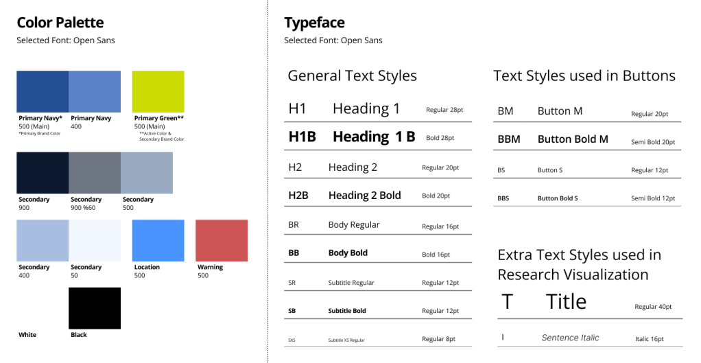
BUILDING A DESIGN SYSTEMS
The ISBIKE went through a rebranding process in 2019. In order not to make users get through such a process again, I decided to use the existing brand colors.
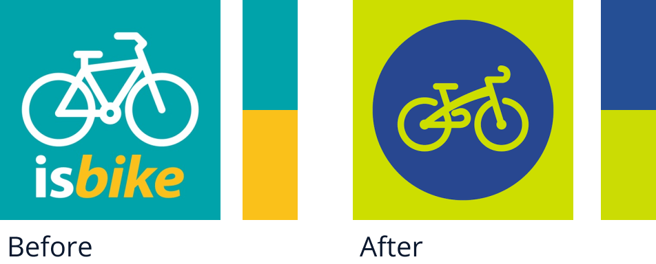
I decided to use the existing brand colors. The selected colors meet the keywords of the municipality’s goal such as “environmentally friendly”, “live”, “active”, etc. I created a new color palette in line with the needs, staying true to the colors of the brand.

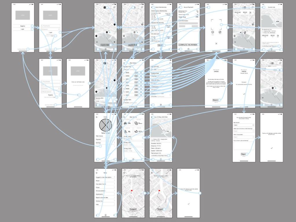
06 FINAL DESIGN
RESERVE
By the time you arrive at the station, all bikes may already be rented and this may disrupt your plans. In order not to walk in vain and to be able to plan, you can reserve a 5-minute bike.
Being able to see which bike was reported for not working properly during the reservation process prevents any negative surprises later on.
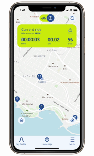
CURRENT RIDE &
CONTACTLESS RENTAL
With QR code technology, using keypads are no longer needed. This feature also reduces the steps of the rental process.
Accessing the riding information not only after the ride but also while riding enables you to control your time and prevent unnecessary rushing or extra billing issues.
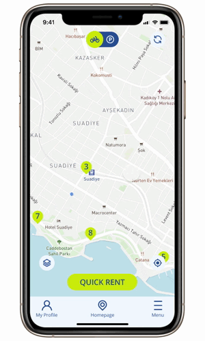
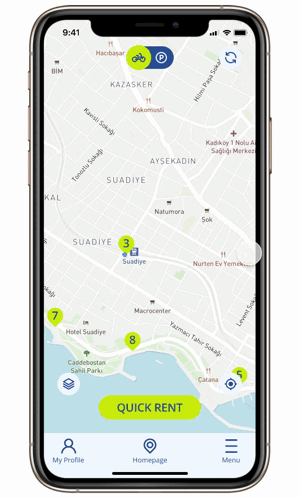
Once you have rented a bike, available parks at the stations become important to deliver the bike. The current ride screen opens with a map showing available parks.
SUGGEST A NEW STATION
If users suggest new station locations according to their needs, Municipality could make data-based decisions, and the users could meet their needs.
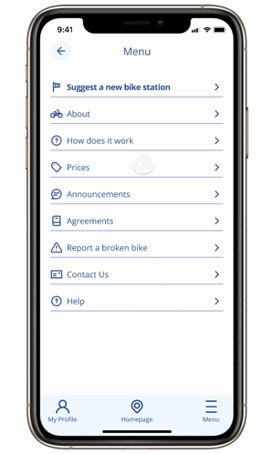
REPORT A BIKE
Biggest frustration among the users were unmaintained and broken bikes. Regular maintenance is great but knowing exactly which bike needs which type of care, the repair team can quickly respond.
This feature also lets the user know if any bikes have been reported. This reduces the possibility of the user encountering a broken bike.
BONUS: Membership Selection & Payment
All relevant and important details about the membership and payment pages can be viewed at a glance. It’s easy to compare and move on to the next step.