CASE STUDY: DeepSport Home Coach
DURATION: 8 Months
Completed in August 2023
ABOUT
DeepSport Home Coach; is a fitness app that offers an efficient exercise experience with motion analysis using artificial intelligence technology.
TEAM
1 UX Designer
2 Developers
DESING BRIEF
Re-designing DS Home Coach 1.0, which was prepared with a small team and did not achieve the expected impact and expected sales, into a salable and desirable DS Home Coach 2.0 as soon as possible.
SUMMARY
My first step as a UX designer was to analyze and understand the current application’s (V 1.0) problems. At the starting point, we had limited resources and time; and no properly built-in analytics existed. As the product team, we made a few inferences by trying to understand the limited analytical data. Then I did a detailed benchmark of the products in the market, and created personas. I defined the problems, started to brainstorm some ideas with the insights I gained, and offered possible solutions. I worked on the information architecture, high-fidelity designs, and phased the implementation process of the app.
After the launch of the V 2.0, I created a research plan and conducted 10+ user interviews & usability testings. With the findings from the research, I alter the design and add some features. I evaluated the implementation process with parameters such as time, impact, and effort and created a road map for the next versions.
01 UNDERSTANDING THE 1.0
DATA
Our starting point for redesigning the DS Home Coach 2.0 had no built-in proper analytics and no resources or time for user interviews. To better understand the current application, we, as a product team, deep dive into the data we can salvage; we came across some pain points that we should focus on. For example, there are specific anchor points that users tend to force-quit the app. When we further investigated, we realized users started the exercise journey without realizing it would be started, and there wasn’t a clear exit from the journey.
ASSETS
Part of understanding the DS Home Coach 1.0 was learning about marketing teams’ plan and the workforce will be put in the product team. This information and the time constraint served as a filter for prioritization and phasing.
EXPERT REPORT
To understand the pain points, I tested the current app’s journeys in the user’s shoes and made some inferences as an export report.
>> App-wide inconsistencies (button sizes, differences of icon locations, size and thickness, hierarchy errors due to color and font size in texts)
>> Not every exercise is suitable for everyone. There should be an option to skip the exercises or suggest another.
>> The most outstanding part of the application is the “track your movements during the exercise and give real-time feedback” feature. Apart from the non-explanatory information in onboarding, it is not noticeable until the exercises start. This feature needs to be better explained in onboarding.
>> If the Free & PRO Plan is offered, the strategy is to show the user that the free version is not enough and that there is much more in the PRO version. The current homepage welcomes the user directly with PRO content, which confuses and frustrates the user.
>> Because individual workouts and periodic workout plans seem & feel the same, It is hard to understand the purpose and benefits of these differences.
>> There is no filter or category for the workout intensity or time. Checking the exercise detail for this information creates too much back-and-forward traffic for the user. Some workout names are not explanatory and feel random.
02 RESEARCH & EMPATHIZE
COMPREHENSIVE BENCHMARK
With a detailed comparison, I had the chance to master the current trends and filter the strengths and weaknesses of the products in the home fitness market. I used Figjam to note positive, negative, and neutral thoughts about the features and designs of the applications as stickers.
I did not limit this analysis exclusively to home fitness mobile apps. I also examined mobile and web apps that use Motion Analysis Technology for any reason.
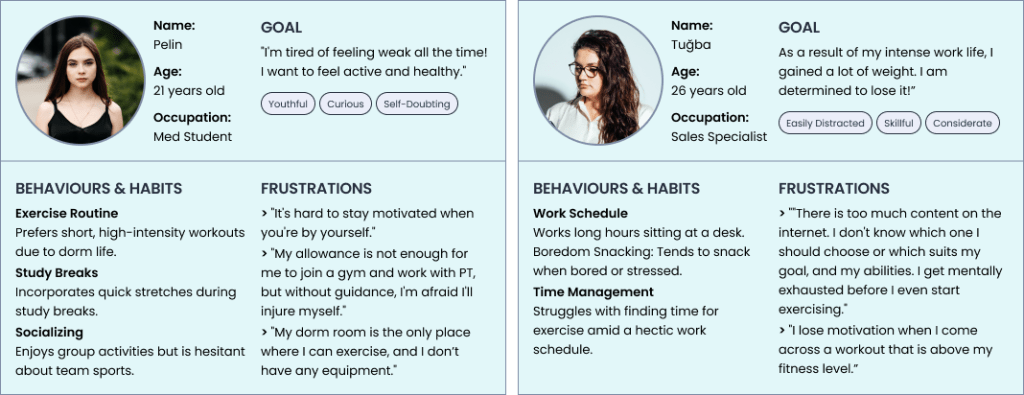
BUILDING PERSONAS
We had a joint workshop with the marketing team and some shareholders to ensure we were on the same page. We had basic information from the current user-profiles and the marketing team’s focus group for the starting point.
Current App User Data
Average Age: 30.29
Most Common Device: iPhone 11
Main Goal: Weight Loss
Sex: 70% woman
Marketing Primarily Target Audience
Age: 25-35
Wellness Enthusiast
> Newly graduated white-collar employees
> Doesn’t like going to the gym
This workshop helped us to meet on the same page and to have a clear understanding of our personas. At the end of the workshop, we had 8 different personas as drafts, and I detailed 2 of them as my primary and secondary persona.
03 DEFINE & IDEATE & DECIDE
PROBLEMS & SOLUTIONS
There is no distinguishable difference between workouts and periodic workout plans from the user’s perspective.
The freedom to choose any other workout remains, but there is only one unique workout plan tailored to the individual user, according to their personal information and preferences.
Homepage welcomes the user directly with pro content, causes confusion and antipathy.
Welcoming the user with a high-value PRO feature with a one-week free condition. Keep the free options within reach, and if there is a PRO feature, make sure users understand the purpose of it. In this way, users can understand the value of the features.
There is no cohesive approach to the app, as there are numerous features with no discernible reasoning, resulting in an overly cluttered and overwhelming interface.
Remove unnecessary features like challenges, mood tracking, community posts, and water intake. Remember these features to add them back if there is a finding from user interviews.
The “track your movements during the exercise and give real-time feedback” feature is unclear until the exercise.
Add information at the onboarding stage and use edited photos that refer to the exercise journey’s technology.
Users unintentionally find themselves In-Exercise Journey and having trouble to end it.
Name the buttons more clearly, make the close option visible, and start the workouts with the same journey everywhere in the app.
The statistics given after each workout are superficial and do not excite the user.
Examine each exercise individually while presenting the summary of total workouts with a period filter. Show the user their progress and inform them about their achievements and milestones.
There is nothing on the app to keep the user motivated.
Allow users to set a weekly exercise goal to help them stick to their plan and reach their target.
04 BUILDING V 2.0
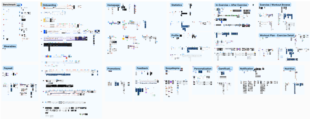
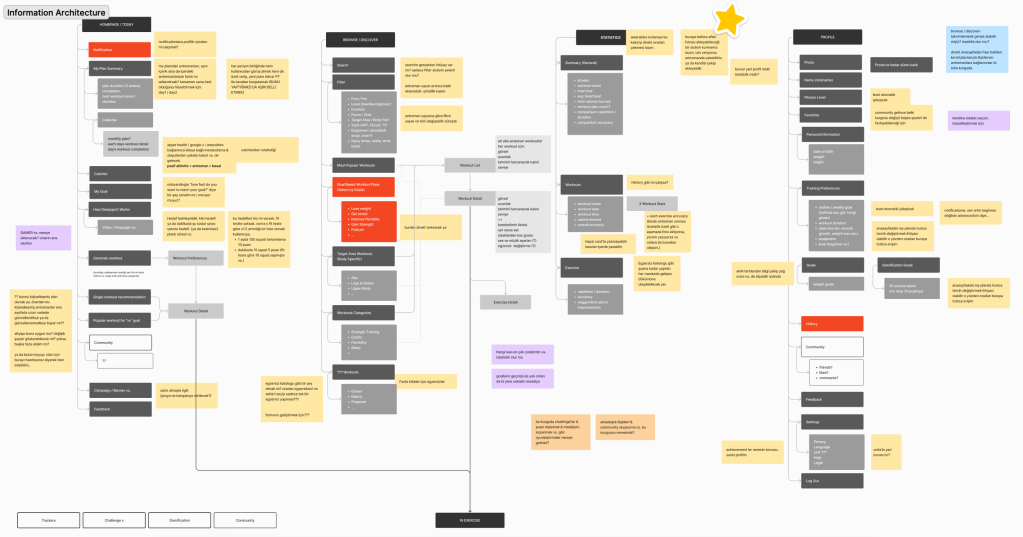
INFORMATION ARCHITECTURE
With the benchmark analysis, personas’ user journeys, and solutions, I came up with the problems, and I created the information architecture from scratch.
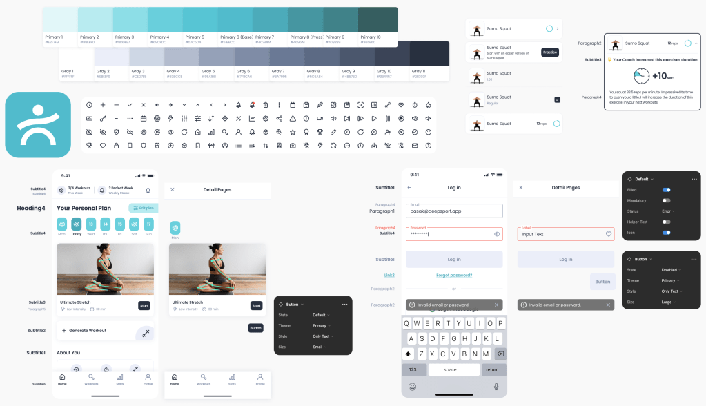
DESIGN SYSTEM
Shareholders wanted to keep the logo and the main color with their reasoning. I kept the primary color, but I created a design system that compliments it for a more modern look.
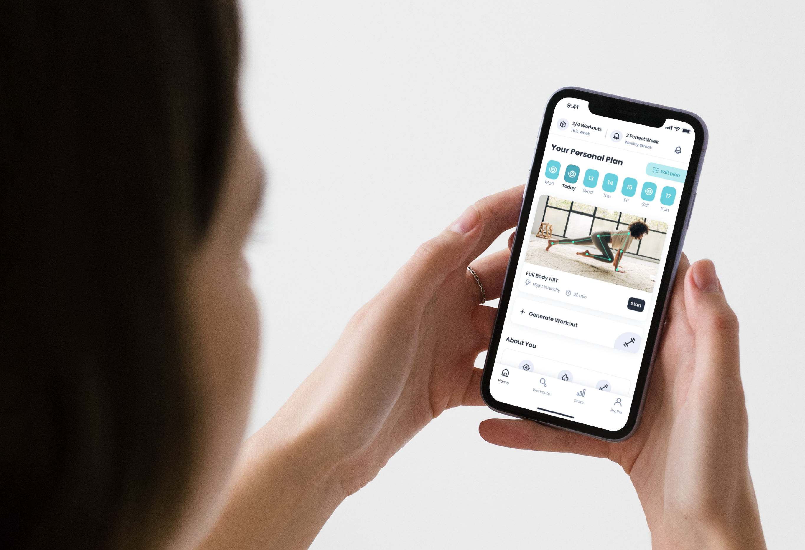
DEEPSPORT HOME COACH 2.0
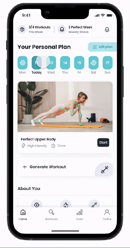
PERSONAL PLAN
Each user gets a personal workout plan tailored to their goals, age, fitness level, etc. This plan adjusts according to their performance. With each workout, the personal plan is reevaluated with some parameters like repetition count, accuracy percentage, and time spent at each exercise, and more advanced exercises are available as users level up their fitness level!
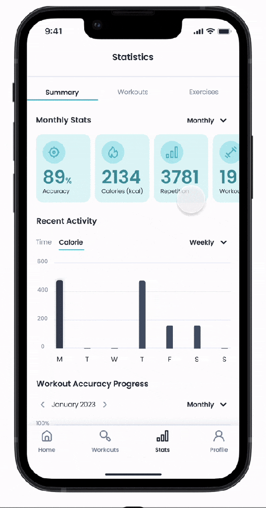
STATISTICS
Workout statistics are more detailed:
1. Overall summary with period filter, user’s accuracy progress, and recent activities
2. User’s workout history with filter & sort
3. Detailed exercise report about user’s progress, best and worst performances, accuracy improvements, some tips for improvements, and a chance to practice easier and more challenging forms of the exercise.
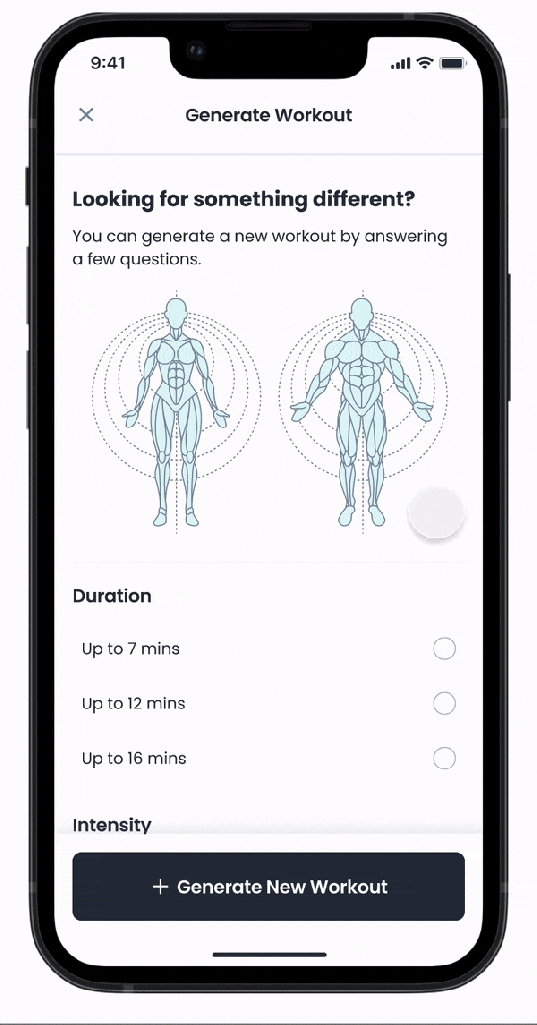
GENERATE WORKOUT
User needs vary from time to time. They don’t have to search through all workouts to see the best one for them at that moment. If users have any special needs or feel rebellious, they can generate their own workout based on their preferences at that moment!
05 TEST
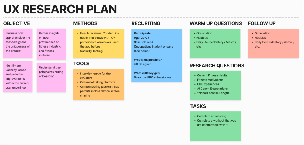
UX RESEARCH PLAN
I created a research plan on the DS Home Coach 2.0. Even though the primary users from data and the personas we built were female, the marketing team aimed to attract more male users to the app, so I took this as an opportunity to experiment & discover, and recruit equally and conducted 10+ user interviews & usability testing on the final product.
USER INTERVIEWS & UNDERSTAND
I separated the interview notes into color codes for positive, negative, and natural opinions. I also determined a separate color code for the suggestions received from the users during the interview.
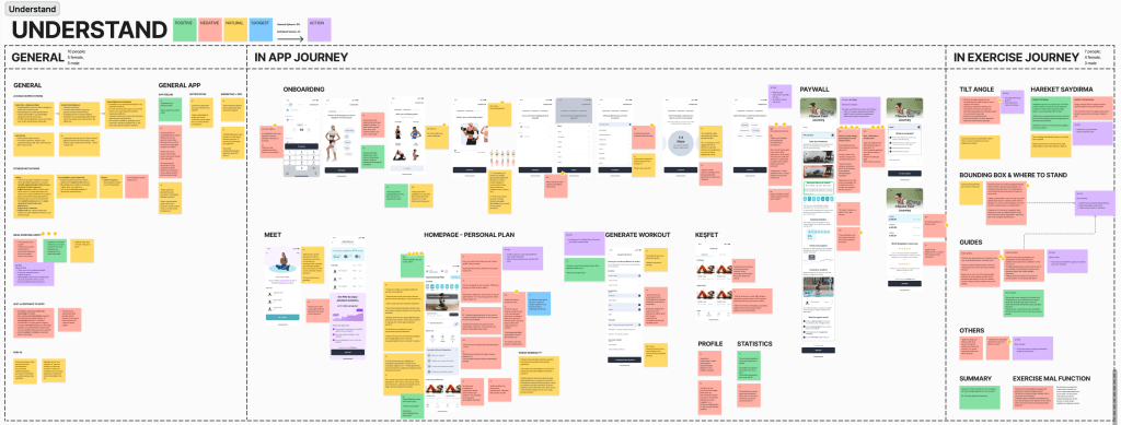
I have organized my notes into three main categories: General, In-App Journey, and In-Exercise Journey because they have different requirements. I further divided the In-App Journey into subcategories based on screens and the In-Exercise Journey into subcategories based on features to cater to the different needs of each category. Additionally, I have marked my notes as general opinions or individual voices when in need.
I suggested some actions based on the research findings. To phase the implementation process of this proposed action plan, I evaluated it with parameters such as time, impact, and effort.
VERSION 2.1 IMPLEMENTS
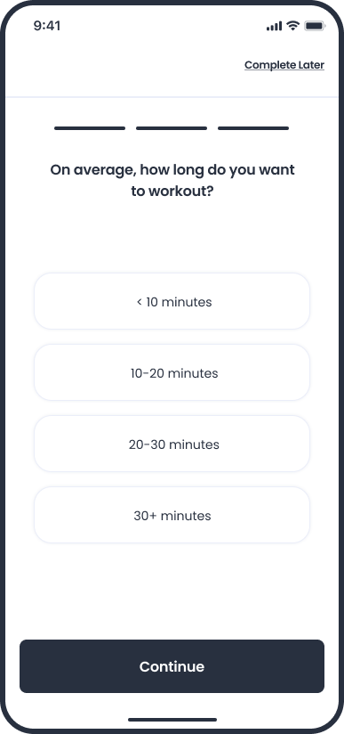
FINDING: Different people have varying opinions on the ideal length of a workout. The promise of a personalized exercise plan tailored to users’ needs does not consider the amount of time an individual is willing to commit to exercise. Users inevitably make assumptions or have expectations regarding personalized content and get disappointed when it doesn’t match what they had in their minds.
ACTION: A question to determine the amount of time an individual is willing to commit to exercise is added to the onboarding phase to tailor the personal plan more accurately.
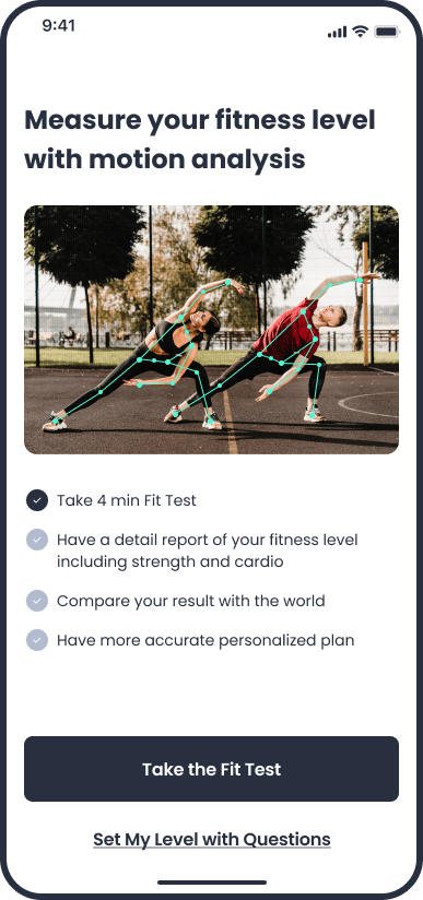
FINDING: Nobody was eager to do a 2-minute introductory workout. Some of them preferred to explore by themselves with a regular workout, while others were not ready to start exercising when they first downloaded the app, even if it was just for 2 minutes, but none of the users wanted to give it a shot.
ACTION: A “Fit Test” is added to help users measure their fitness level and customize their personal plan.
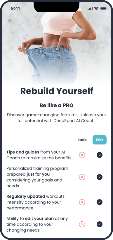
FINDING: Users found it difficult to understand which features are PRO and which are Basic, and not seeing the prices at first glance made them anxious to move forward.
ACTION: A new paywall is designed in a one-pager format, including the PRO-Free comparison, the prices, and user feedback.
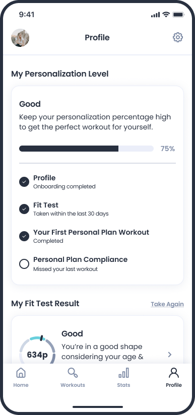
FINDING: Users had difficulty recognizing the personalized exercise plan tailored for them, and they couldn’t make sense of how it was changing.
ACTION: A section is added to the profile page where users view what affects personalization and what they can do to make more accurate personalization.
FINDING: During the onboarding phase, several users found it challenging to choose the days of the week they wanted to exercise in advance. Among the intuitive and quickly answered questions, they felt the answer to this question was a significant responsibility and were caught off guard by it.
ACTION: Removing things that do not serve the desired purpose can sometimes be the best solution. The question of which days a user would like to exercise was removed by keeping the question of how many days a week a user would like to exercise. For example, instead of a workout that a user has to do on Monday, there are several workouts they choose to complete per week.
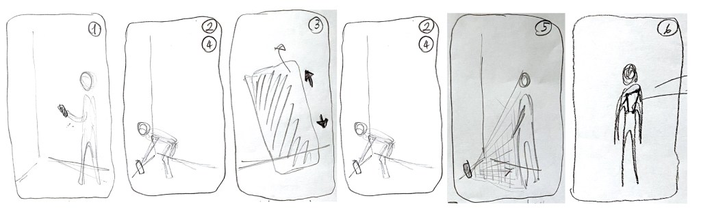
FINDING: Users encountered various problems when setting the camera correctly and scanning their body to the system. This problem is caused by not listening to voice guides or not reading thoroughly exploratory writings, etc.
ACTION: An explanatory video is added to the background to the “adjusting camera screen” at the beginning of the exercise, showing how a user adjusts the camera correctly.
FINDING: Voice guides were insufficient in scenarios where users did the exercises incorrectly because the green skeleton appearance is permanent. And it misled the user and damaged the reliability of the application.
FUTURE ACTION: When the users do not perform the exercise correctly, the skeleton turns red, and when the users do not stop where they should be, guidance is provided using color codes for the correct position.
06 FINAL THOUGHTS
Working in a fast-paced startup environment taught me a lot.
I used to be very strict about design thinking; I believed every design decision should be made on data. But it is not sustainable with every decision. Sometimes, you had to trust your gut, follow your instincts, and analyze the results.
I also learned to compromise. In this way, you have the energy and resources to fight the things that matter the most.
I also improved my juggling skills by considering the user’s needs with shareholders’ and chief officers’ requests.
