CASE STUDY: Apollo
DURATION: 3 Days
Completed in Nov 2025
ABOUT
Apollo Eco is an energy analytics platform that enables industrial facilities to monitor and analyze energy consumption across multiple resources.
DESING BRIEF
The brief focused on redesigning Apollo’s Consumption Dashboard to make complex energy data easier to understand, compare, and interpret. The goal was to help users see total consumption clearly, explore individual resources when needed, and identify anomalies with confidence.
MY ROLE
This project was completed independently as a product design case for an interview process.
SUMMARY
In this case, I reviewed an existing consumption dashboard, identified usability and hierarchy issues, and proposed a refined dashboard structure through high-fidelity design. The work focused on improving interpretability and scalability while keeping the visual language largely intact.
EASY ACCESS
01
UNDERSTAND
To start, I explored Apollo’s product ecosystem and website to understand how the platform supports industrial users in monitoring and optimizing their energy consumption.
This exploration helped me;
- clarify the product’s core value proposition
- identify the primary user groups (such as facility managers and sustainability teams)
- understand the key metrics users care about, including total consumption, efficiency, anomalies, and cost-performance balance
This step ensured that design decisions would be grounded in real operational needs rather than surface-level visual assumptions.
02
ANALYZE
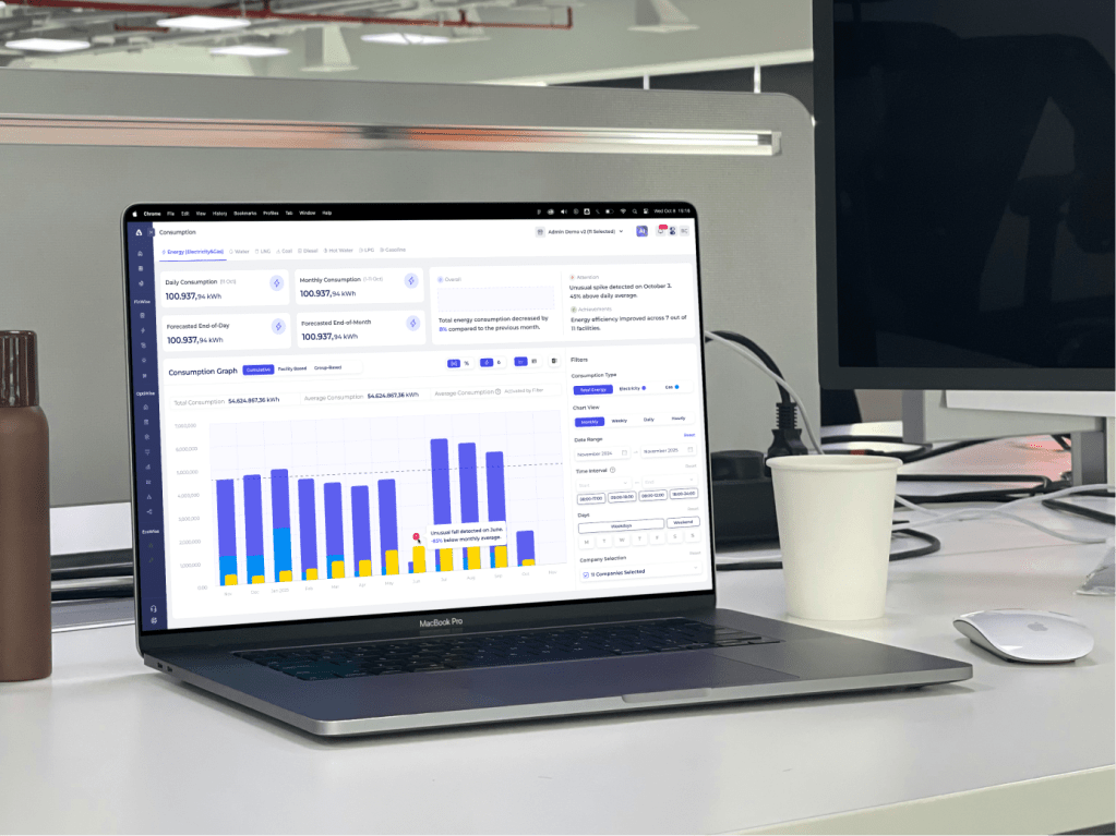
In this step, I reviewed the existing Consumption Dashboard to identify usability, hierarchy, and interpretability issues that make it harder for users to derive insights.
Filters vs Results Area
The lack of clear separation between filters and the results area makes it harder for users to understand which controls affect the data and which elements are purely informational. This increases cognitive load, especially for first-time users.
Inconsistent Controls
When controls that affect similar outcomes are visually grouped inconsistently, users need extra effort to understand how to manipulate the chart, slowing down analysis and increasing the chance of misinterpretation.
Core Toggle Placement

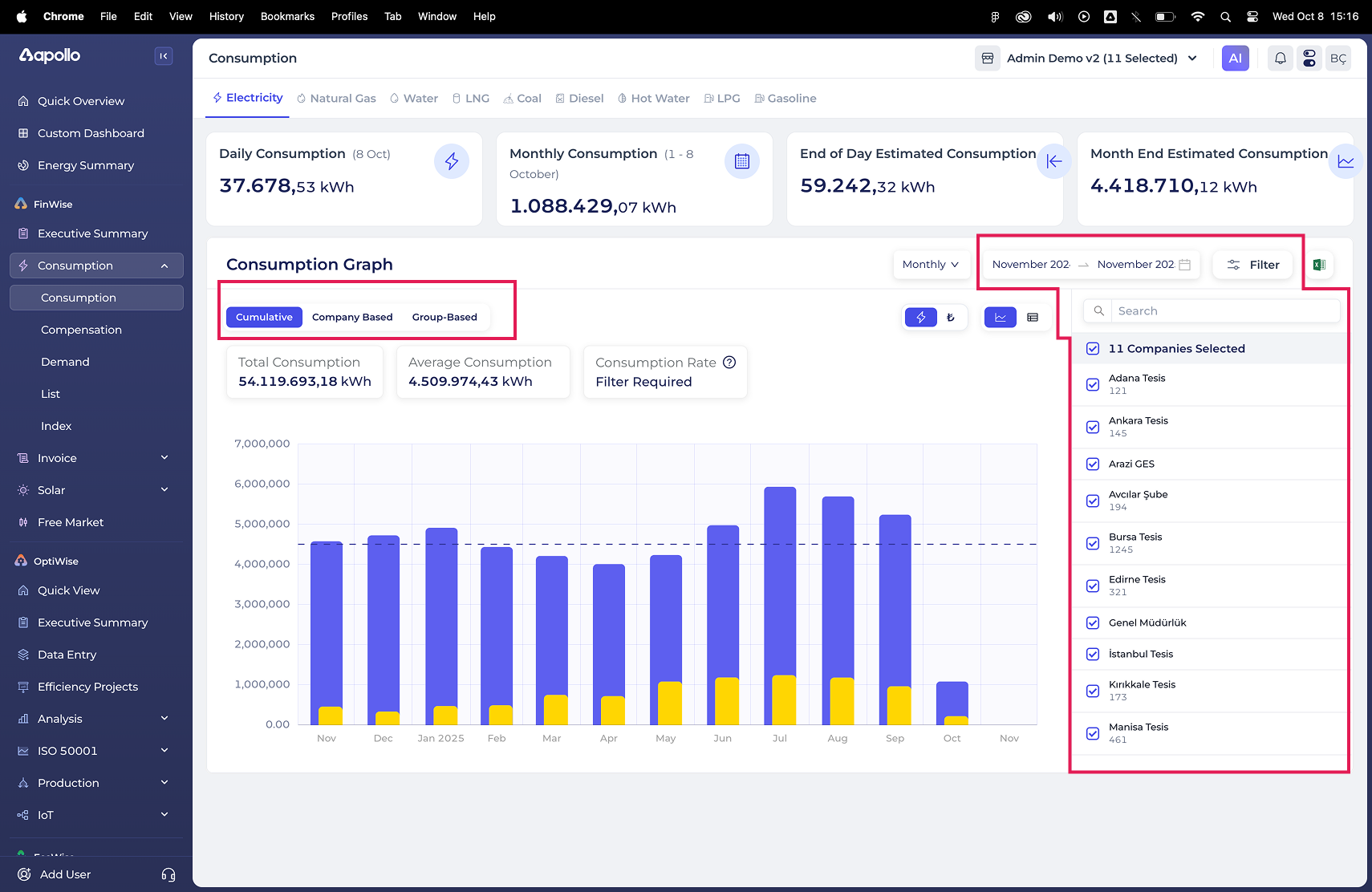
This toggle defines the core logic of the chart. It determines whether users see aggregated or segmented data. Because this toggle is placed among secondary filters, users may overlook a critical decision point that fundamentally changes how the data is displayed, leading to incorrect comparisons or missed insights.
Highlight Section Visual Conflict
When dashboard’s insights visually compete with dashboard highlights, users struggle to quickly identify what information is most important, what is a filter and what is an insight. This reduce the effectiveness of the dashboard’s insights.
Default State with Sub-filters
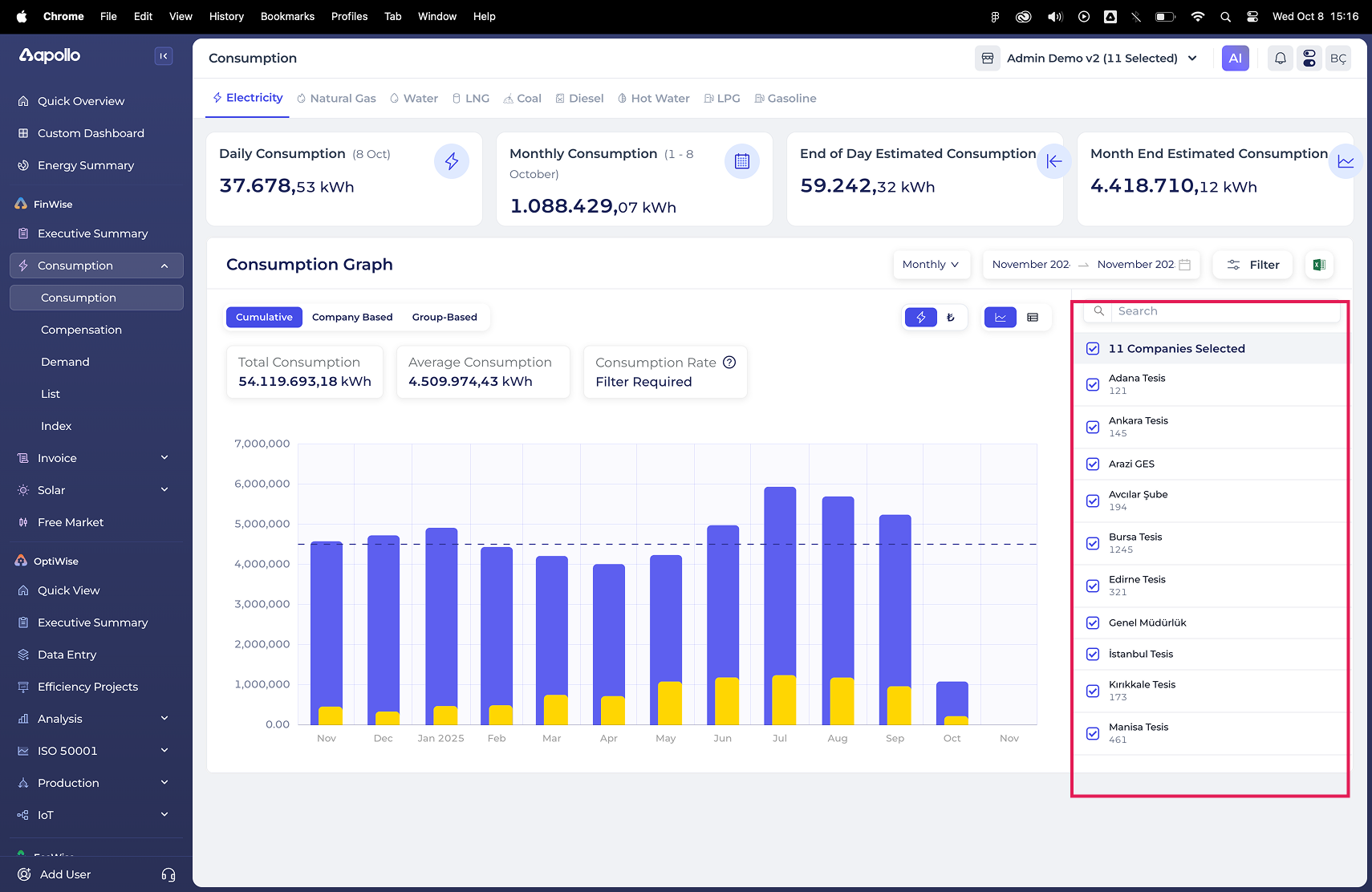
Starting the dashboard in a filtered state introduces unnecessary complexity upfront, making it harder for users to grasp the overall consumption picture before diving into details.
Overall Verdict
Unclear filter hierarchy and high information density slow down insight discovery, forcing users to spend more time understanding the interface rather than interpreting the data itself. These issues informed the design decisions in the next phase, where clarity and interpretability became the primary focus.
03
IDEATE
First Design Decision
I intentionally focused on improving clarity and usability, avoiding major visual redesigns or UI overhauls. The goal was to reduce cognitive friction for existing users and preserve consistency within an already functional interface. As Nielsen Norman Group highlights, consistency and learnability often have a greater impact on dashboard usability than aesthetic refinement.
Design Intent
With this direction in mind, I explored how the dashboard could better support users in making sense of their energy data. From a user perspective, this meant enabling them to understand total consumption at a glance, drill down into individual resources when needed, notice unusual patterns, and compare energy sources with confidence.
These intentions guided the exploration of a dashboard concept centered on clearer information hierarchy, more legible interactions, and improved data interpretability
04
DESIGN
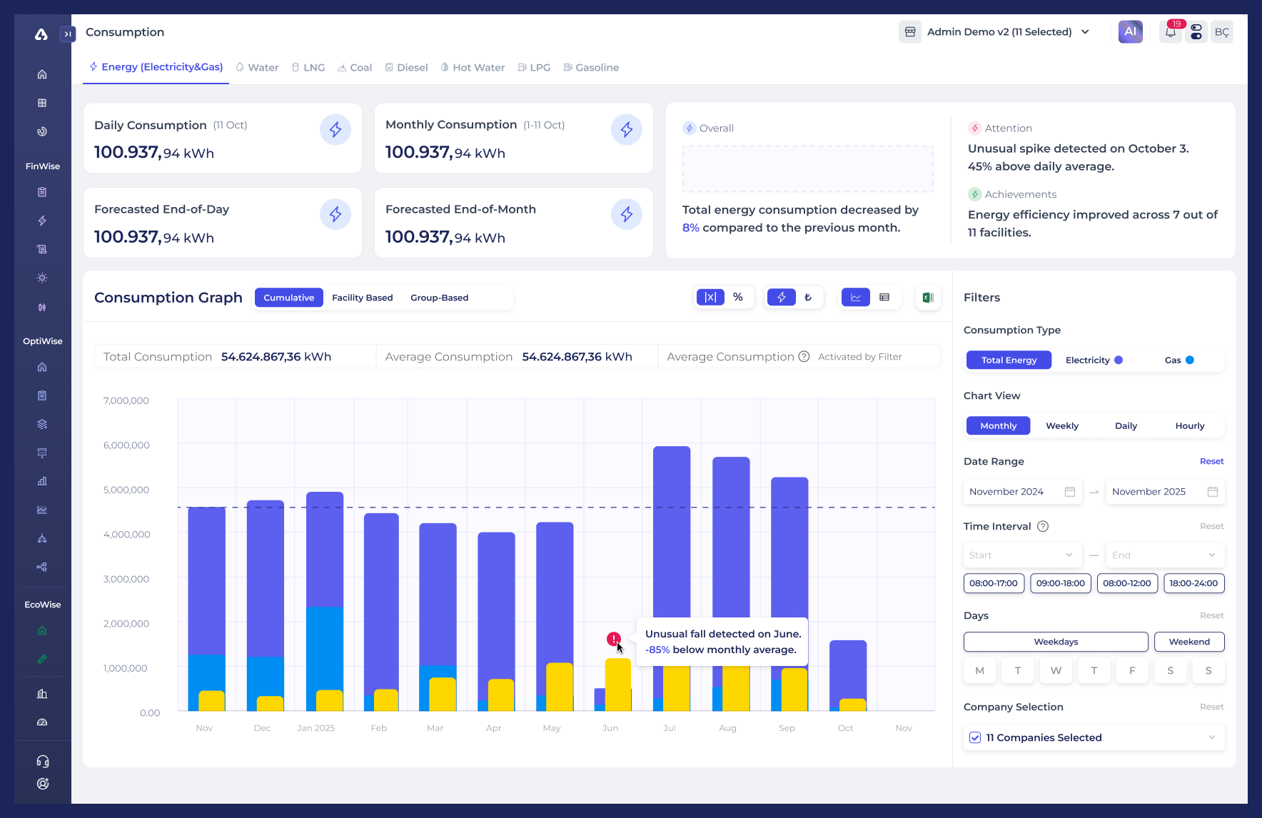
Consumption Dashboard
A redesigned core dashboard focused on improving interpretability of energy consumption data through clearer structure, hierarchy, and system-driven insights.
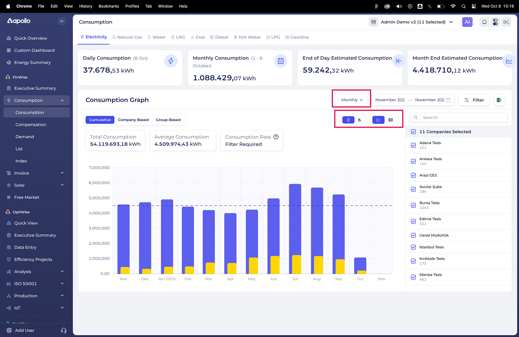
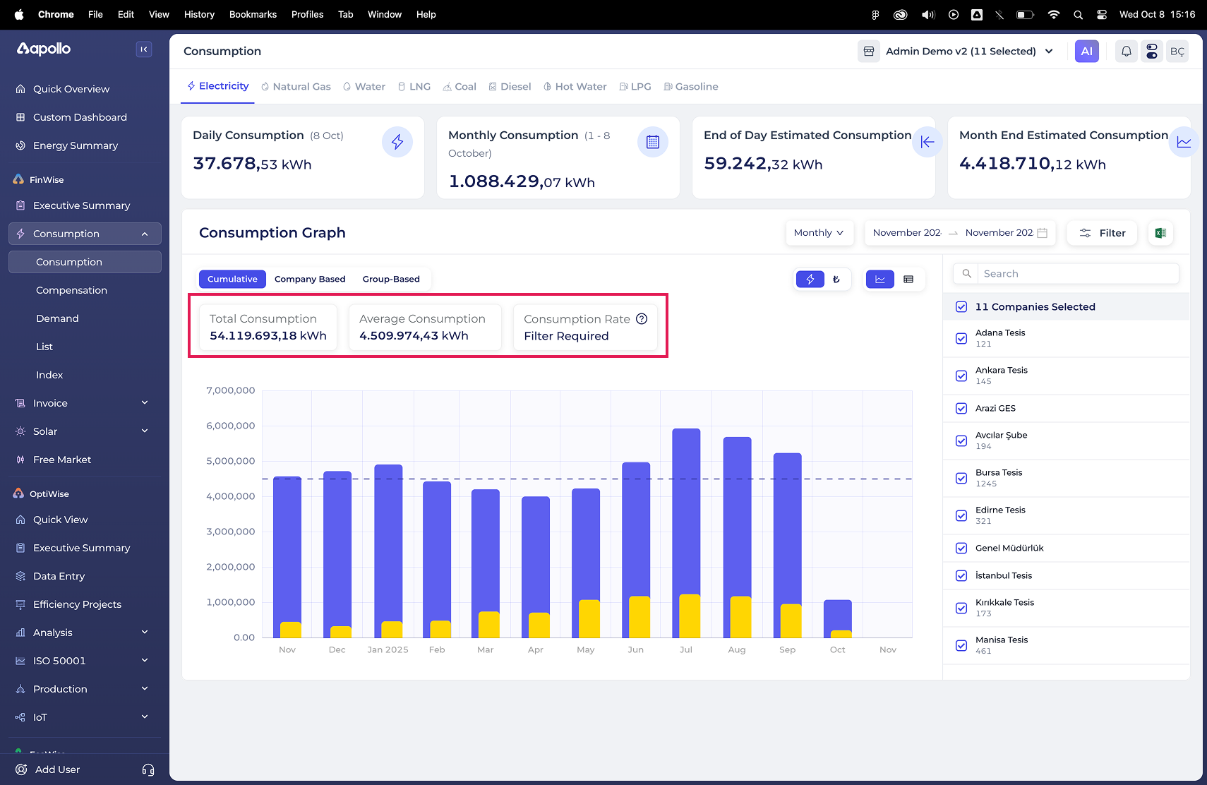
Key improvements include a more distinct separation between KPIs and charts, a structured filtering model for energy type, time range, and company selection, and a primary data view toggle (Cumulative / Facility / Group) that clearly defines how consumption is aggregated.
Anomalies are highlighted directly within the graph and explained in plain, contextual language to support faster understanding.
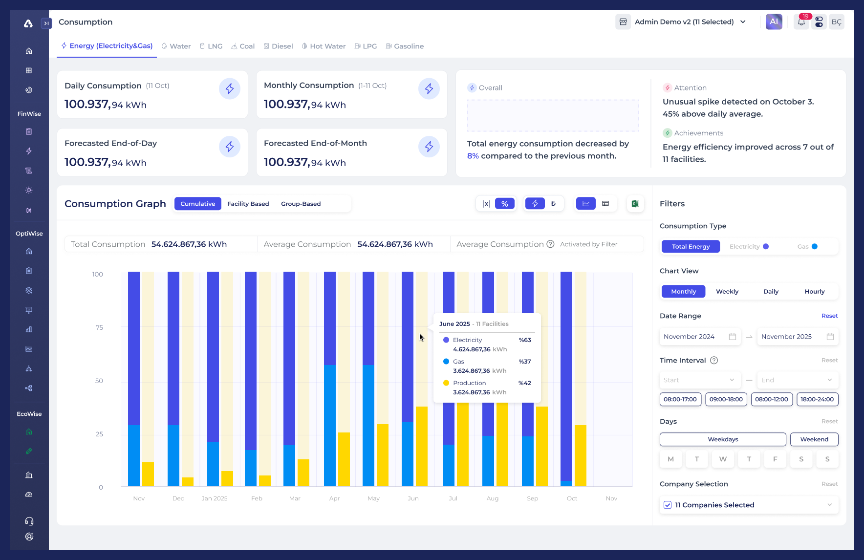
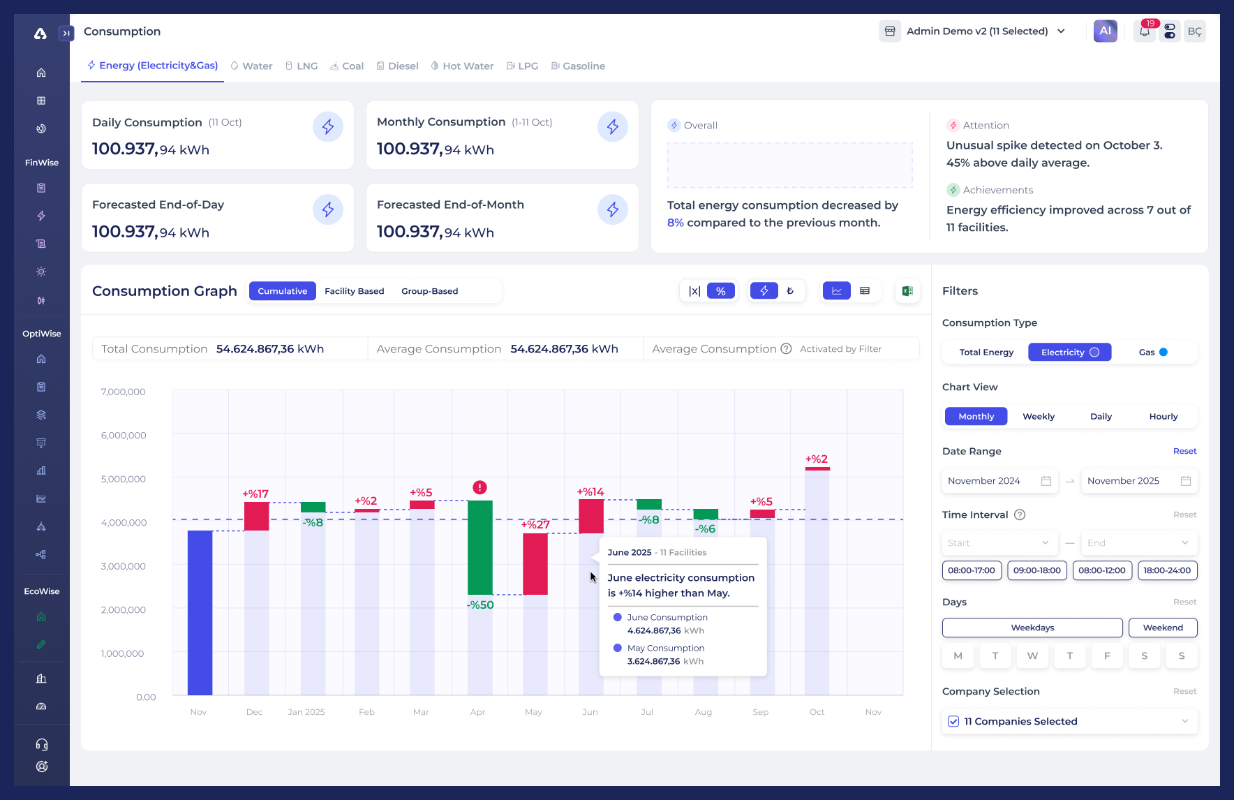
Playground
An experimental space designed to explore how percentage-based representations can make energy data more relatable and easier to compare.
By shifting from absolute values to relative distribution, this view helps users focus on balance and change between energy sources rather than raw consumption numbers.
Version 1
This version emphasizes the proportional relationship between electricity and gas consumption, enabling users to quickly understand their relative share within total energy usage.
Version 2
This iteration explores percentage-based change over time, helping users perceive consumption shifts in a more intuitive and comparable way.
05
DESIGN CONSIDERATIONS & WHAT’S NEXT
Some design decisions in this case were intentionally assumption-driven, as behavioral usage data was limited. This section outlines potential next steps based on how users might interact with the dashboard over time.
Filtering Panel
The filtering panel currently holds strong visual priority. If users frequently adjust filters to explore different scenarios, keeping them persistently visible is justified. However, if usage skews toward result interpretation rather than configuration, transitioning the filters into a side drawer or contextual overlay could better support that flow.
Additionally, closely related controls such as Date Range, Time Interval, and Days could be grouped under a single Time Settings section to reduce cognitive load.
Information-Dense Graph
The Consumption Graph presents multiple layers of information at once. As a next step, separating “Cumulative” and “Facility-based” views into dedicated charts (each with tailored filters) could improve focus and make patterns easier to interpret.
